Table of Contents

The Economic Value of Thought Leading Analysis

Facebook
Twitter
LinkedIn
Email
WhatsApp
Economic Value of Thought Leading Analysis

Overview

As everyday users of technology many of us have become inured to how pervasive our use of technology is. It is rare today to see someone walking and not looking at their phone at the same time. Our universal obsession with technology sometimes results in comical or even tragic consequences as these videos demonstrate

What is it that keeps us so tethered to and focused on our technology? The answer could be related to a concept uncovered years ago called the “Doherty Threshold”. The concept simply stated is that if a system responds quickly enough to a user, the user will stay focused on that system and their productivity will go up commensurately. The concept was originally presented in an IBM publication titled “The Economic Value of Rapid Response Time” by Arvind Thadhani and Walt Doherty of the IBM TJ Watson Research Laboratory (IBM publication # GE20-0752). The AMC TV series Halt and Catch Fire references this concept in one episode. 

The “Doherty Threshold” is an illustration that the human mind functions best when focused on a task and as long as the details related to that task are presented quickly, the mind will stay focused on that task. The “Doherty Threshold” shows productivity improvements of 3x to 5x depending on the complexity of the task if the underlying system is able to present the user the information quickly enough. Interestingly, the more skilled the user the more dramatic are the productivity improvements. 

This concept is relevant to any situation in which a user is leveraging technology to perform a task. We would call it “The Economic Value of Thought Leading Analysis.”

Application to Business Decision Making

Today’s user of technology is often a business executive or an operational line manager. The technology’s only value to them is how it helps them make decisions on how to run the business. In organizations that have implemented an Enterprise Resource Planning (ERP) system, the system serves as a great compiler of the various activities and operations of the business. All manner of data about the operation of the business are being loaded into and compiled by the ERP system. For a business this data is essential to understanding how the business is running, where changes need to be made, what is not working, what is working, etc.

To be able to see into what is occurring in the business a technology that enables a business user to apply this “Thought Leading Analysis” is needed. Below we will look at several examples of how our analytics technology “IntelliDash” provides this type of “Thought Leading Analysis” to enable a business user to not be distracted and stay focused on the task at hand. Any activity that redirects their thoughts or interrupts their focus from the task at hand such as: running additional queries, having to filter via a spreadsheet, accessing another data source, etc. interrupts their “Thought Leading Analysis” and causes their productivity to drop.

Purchasing Example

A Director of Procurement might be interested in knowing where spending on procured goods might be out of line with what is expected. To examine this they would access a dashboard called Purchase Price Variance. (see below)

Figure 1 Purchase Price Variance by Product and Vendor

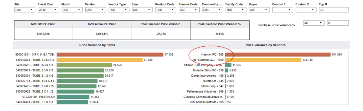
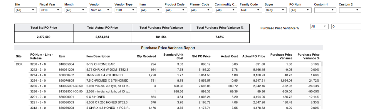
In this example the Vendor “Nam AC PC 555” (see red ellipse) shows up as having the highest price variance in dollar amounts from what is expected. (NOTE: Data is for the entire year of 2019) By simply clicking on this bar a user is able to see the complete list of products acquired from this vendor, in PO detail, for 2019. (see Figure 2 below).

Figure 2 Purchase Price Variance by Vendor Detail

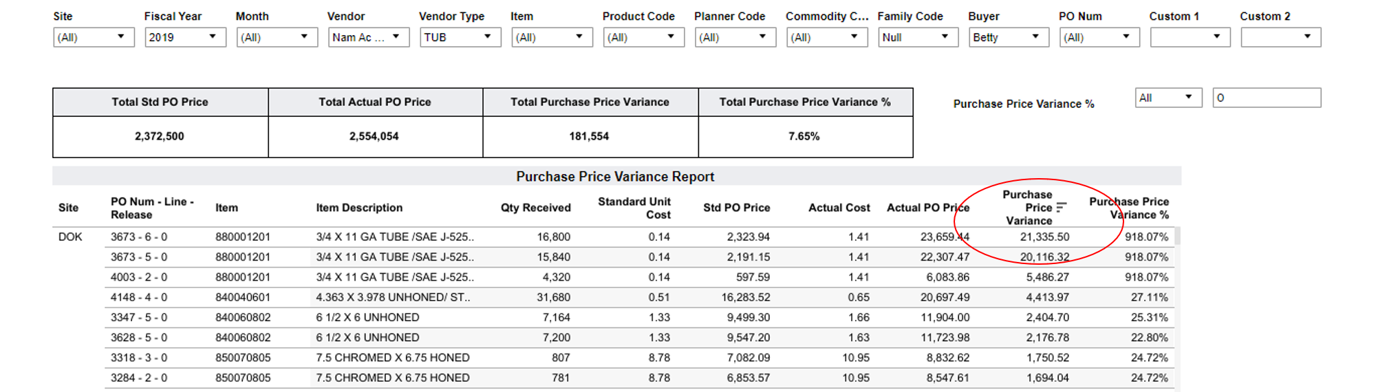
One additional click allows the user to sort by Purchase Price Variance from high to low to see which actual items are the primary contributors to this difference in expected versus actual price paid. (See red ellipse in Figure 3 below)

Figure 3 Purchase Price Variance by Vendor Detail Sorted

Finance Example

A Chief Financial Officer might want to know what products or customers the organization are losing money on. The Bookings Margin Matrix dashboard will show which product categories are actually losing money by sorting on the Margin field from low to high (see red ellipse in Figure 4 below)

Figure 4 Bookings Margin Matrix by Product Code

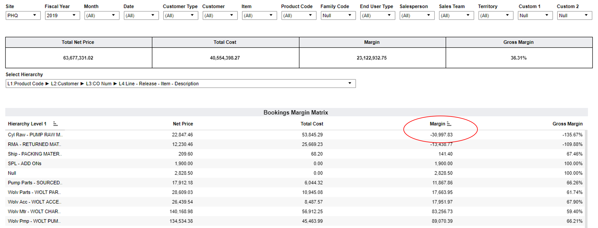
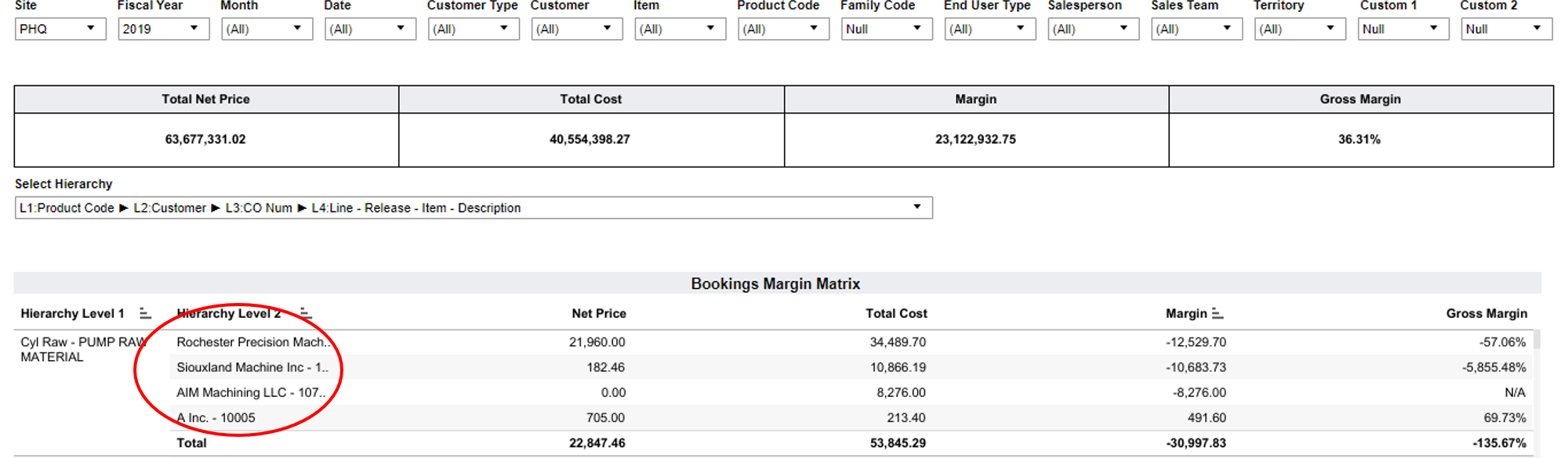
In this example we can see that the Pump Raw product code has a negative margin. The user can then click on the first column and it expands to show which customers these products were sold to (see red ellipse in Figure 5 below)

Figure 5 Bookings Margin Matrix by Product Code and Customer

The user can then expand the next two columns by clicking via the mouse on a + sign at the top of the column and see the actual Customer Order Number and the specific Item that caused the negative margins (see red ellipses in Figure 6 below)

Figure 6 Bookings Margin Matrix by Product Code and Customer and Customer Order Number and Item Description

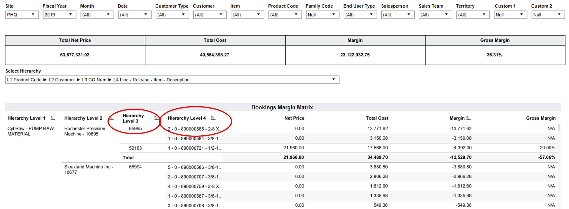
This data can enable the Finance person to take whatever action might be necessary on these products and orders in the future.
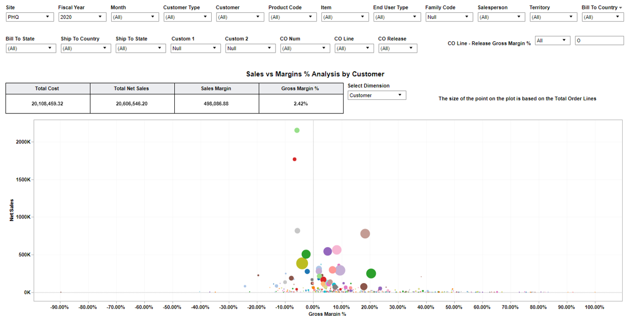
Sales Example

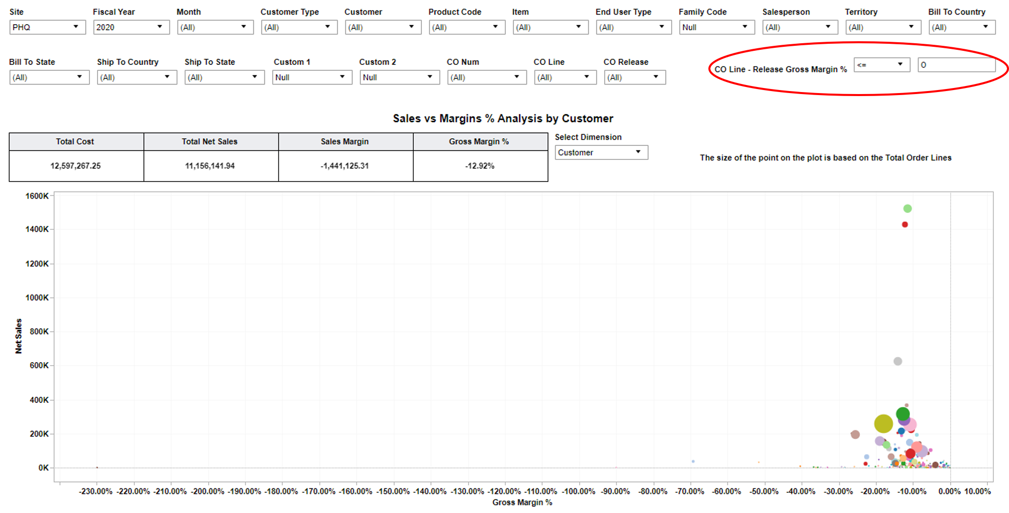
A VP of Sales might want to understand what Customers are the least profitable over the current Fiscal Year. The following chart shows the Gross Margin % by Customer. (see below)

Figure 7 Net Sales and Margin % by Customer

By using the filter in the upper right (see red ellipse in Figure 8 below) this can be adjusted to show just Customers with negative Gross Margins

Figure 8 Net Sales and Margin % by Customer with Negative Margins

By then hovering over the uppermost bullet you can see which customer it is and the dollar amounts involved. (In this case the Neque Nullam Institute) (see Figure 9 below)

Figure 9 Net Sales and Margin % with Negative Margin for a Specific Customer

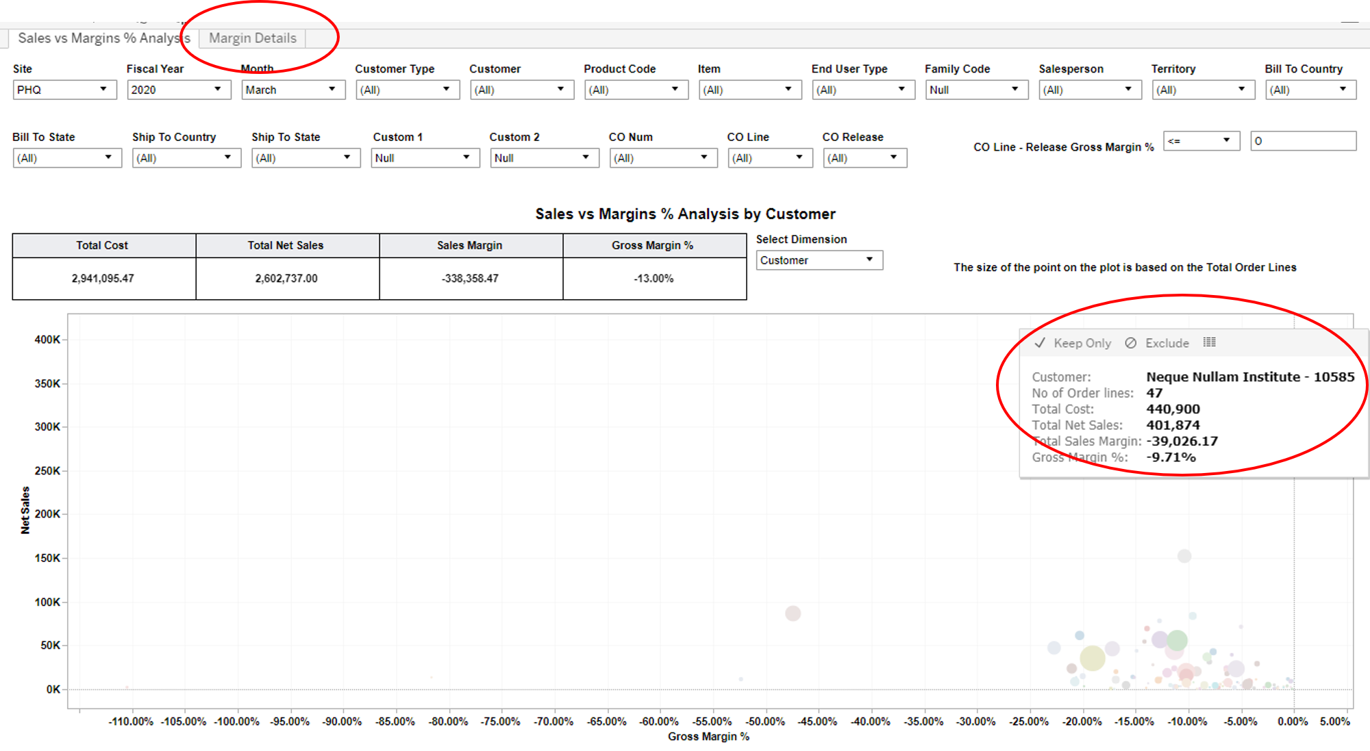
By selecting the Keep Only option above (see red ellipse in Figure 9 to the right) we can narrow the data to only look at this one Customer (see Figure 9 above)

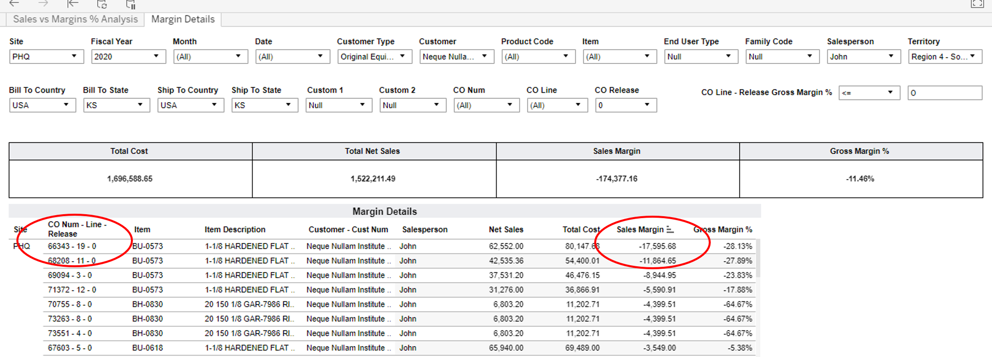
Lastly When we click on the Margin Details tab above (see red ellipse in Figure 9 to the left above) it will take us to the actual Customer Order Details

We can now see the detail on exactly what the Actual Orders were to this Customer (see Figure 10 below). Then by clicking at top of of the Sales Margin column we can sort from high to low the actual dollar amounts and Customer Orders which contributed to these negative margins from highest to lowest (see red ellipses in Figure 10 below)

Figure 10 Net Sales and Margin % with Negative Margin for a Specific Customer with Customer Order Number Detail

Summary

We have looked here at the various ways in which a business person is able to look at data that has been captured in an ERP system and is able to drill into that data in a logical fashion and understand the details. We explored a concept called the “Doherty Threshold” that explains and underscores how important and valuable it is for a user to be able to quickly, in a logical fashion, get answers to specific questions. Using several examples above we have shown how this is possible to do this in a “Thought Leading” flow such that the person doing this analysis is able to logically move from question to question that pops into their mind without being distracted or having to jump to another data source or another system. Instead they can follow the “Thought Leading” approach of their own mind and get an answer to a specific business issue or question as it arises. 

Our technology and dashboards enable this type of analysis. They were designed and have been honed with user input to enable just such “Thought Leading Analysis.” Reach out to us and we can show you how this is done.

Schedule a Demo to look at the numerous Manufacturing KPIs that IntelliDash offers from your Infor CSI/SyteLine data (On-prem & Cloud alike)

This site tracks visits anonymously. Click the link to know more about our Privacy Policy.